TheDragShot / Discord Classic Style
Discord Classic Style

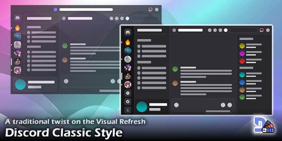
A collection of styles for Discord Web, intended to make layout and color adjustments to the UI introduced in the Visual Refresh so it looks more like its previous version.
The main goal of this script is to undo some unpopular changes and take the Discord visual experience back to what the community is used to.
For the intended looks, the "Ash" theme is recommended, but any official theme should work fine, including light ones.
Features
- A hotfix for the misaligned call icons on DMs.
- No top bar in the browser app. Inbox and Help buttons appear next to the search bar.
- A server list not obstructed by the top bar or the user panel.
- Server icons are 48px in size, and they are displayed as round unless they are focused or hovered.
- Channel categories are displayed in all caps.
- A user panel docked under the channel list.
- Minor UI color tweaks to better mimic the old layout from before the refresh.
Being developed
- Ensure the sustainability of the modifications.
- Maybe figure out a way to embed a font explicitly in the script.
Change log:
v2.2.0:
- The size of the icons in the server list has been increased back to 48px.
- The left borders of the channel list and user panel are now hidden in dark themes.
- The "Active Now" panel has now a darker color like the member list.
- Prevented opening of links when trying to zoom in on the preview of a embed's thumbnail.
v2.1.0:
- Hiding the top bar is now handled by a CSS variable, hopefully improving forward-compatibility.
- The user panel has been fully aligned with the channel list.
- The server list now occupies the full height of the screen as before the refresh.
- The private categories on the home tab have been set to all caps.
- The chat box has been pushed downwards, reducing the awkward gap at its bottom and returning some more pixels of space to the channel content.
- The "Someone is typing" and "Slowmode enabled" notes have been integrated to the chat box in order to avoid overlaps.
v2.0.0:
- Reworked the script in order to make it work with the Visual Refresh update.
- Added a hotfix for the misaligned call icons on DMs.
- The new top bar has been hidden.
- The Inbox and Help buttons have been moved next to the search bar.
- The server icons are now displayed as round unless they are focused or hovered.
- The channel categories are now displayed in all caps, and their font size has been reduced.
- The user badge is no longer floating, restoring some wasted space.
- Removed support for the layout used in the New Brand update.
v1.0.9:
- Updated some classnames used in profile popups.
- Minor adjustments to the profile preview - I hadn't noticed that was affected by the script as well.
v1.0.8:
- Restored usage of GG sans, Whitney font can still be used if you have it installed.
v1.0.7:
- Restored the Whitney font for a while longer. Given the app's content policy, it is unlikely this patch will last for too long; but at least the new font isn't any bad.
v1.0.6:
- Fixed a visual bug due to some class name changes.
v1.0.5:
- Reduced the size of Nitro profiles. They're unnecessarily huge!
v1.0.4:
- Minor changes to the appearance of "New Unreads/Mentions" popups in the channel list.
v1.0.3:
- Restored the bold font weight in the server, category and chat titles.
v1.0.2:
- Restored the old brand SVG image at the title bar (Desktop Client only).
v1.0.1:
- Dropped usage of the
newBrandclass, as it seems to have been removed. RIPoldBrand.
Rating: 4