Kir_Antipov / GitHub Defreshed
About
So, Microsoft took yet another step to prove to some last doubters that Microsoft is the worst thing that happened to GitHub ever.
This time effective managers from Microsoft (tbh, I don't think there were any UI/UX designers involved into this) turned repository page into some unusable low quality piece of :shit:.
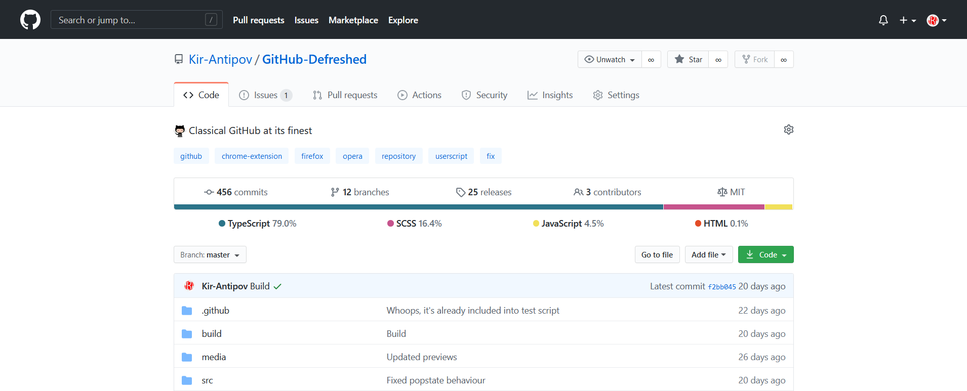
Preview
Repository page (Default light):

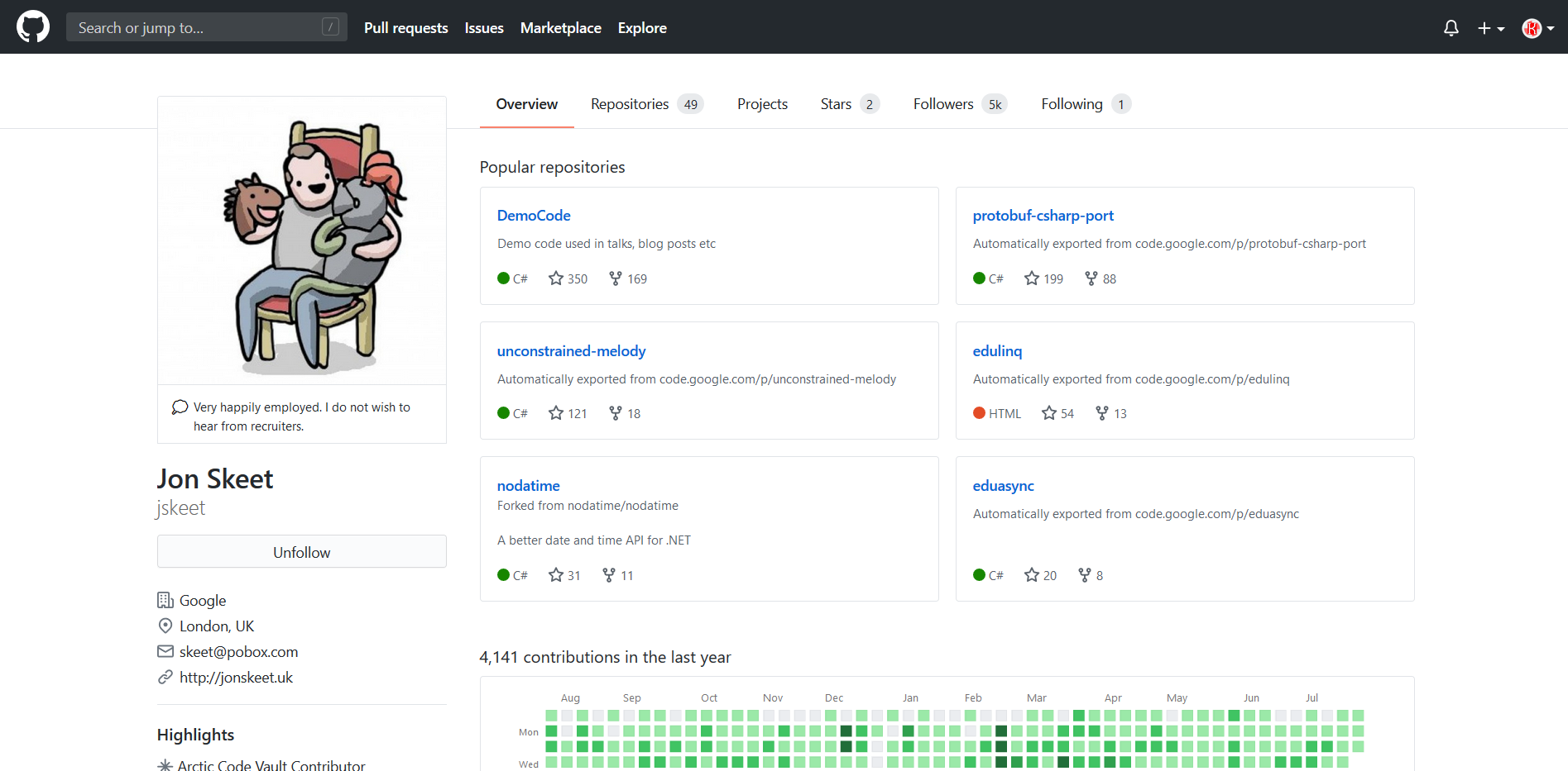
Profile page (Default light):
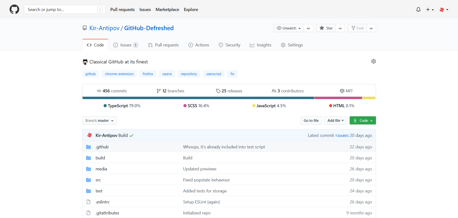
Repository page (Default light + Enable light header):
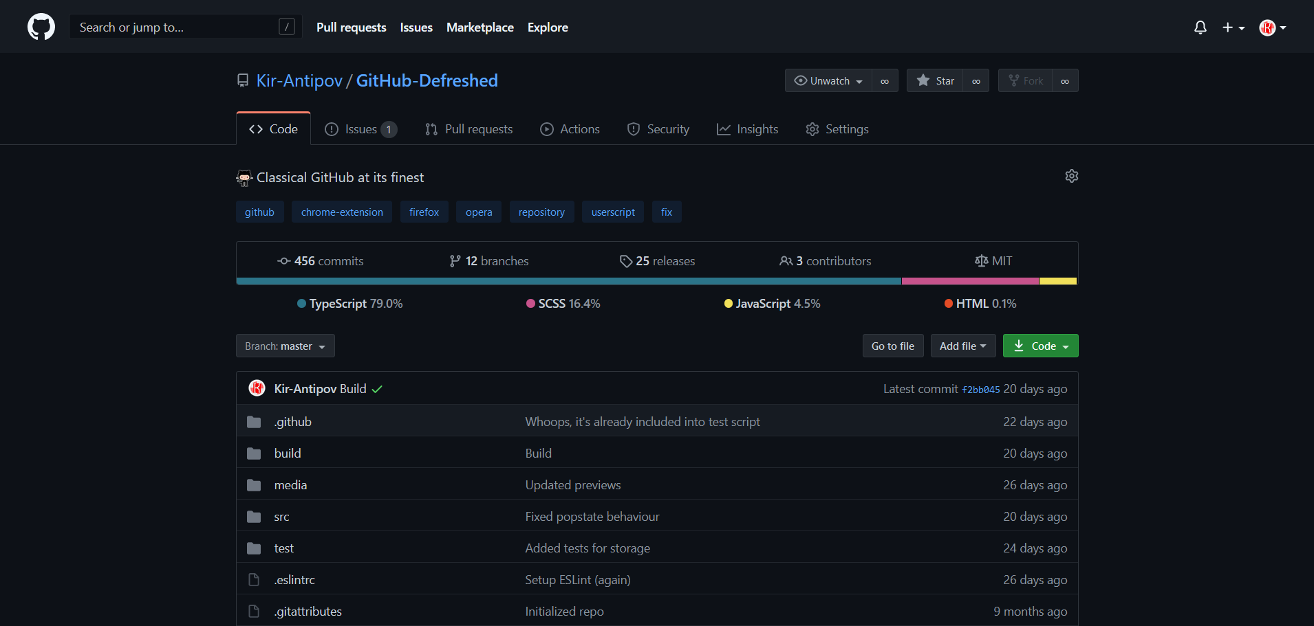
Repository page (Default dark):
Repository page (Dark dimmed):
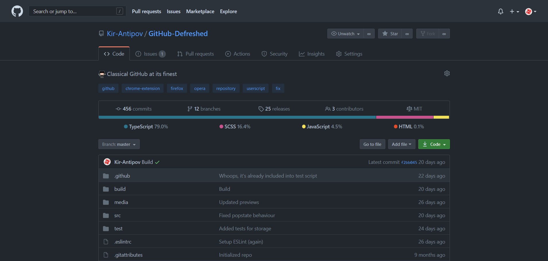
Just ol' buddy GitHub in person
Installation
Firefox
🦊 Install Firefox add-on.
Google Chrome
📦 Install Chrome extension.
Opera
🔧 Install Opera add-on that adds Chrome extensions support to your browser.
📦 Install Chrome extension.
Any browser
🐵 Install Greasemonkey, Tampermonkey or any other browser extension that supports an execution of user scripts and then
📦 Install the user script which supports automatic updates and customization.
Features
- Old style header
- Light header
- Prettified
AboutandSummarysections - Prettified README
- Unhidden commit message
- Unhidden user status
Stars,FollowersandFollowingtabs are back- Unrounded buttons, avatars and containers
- Full support of custom themes (e.g.,
GitHub-Dark) - Full support of default themes (
Default light,Default darkandDark dimmed) - Partial support of other scripts and extensions (e.g.,
Refined GitHub). Partial, since none of developers (including myself) can be sure that their extension is compatible with every plugin with unknown functionality in the world - And much more!
Settings
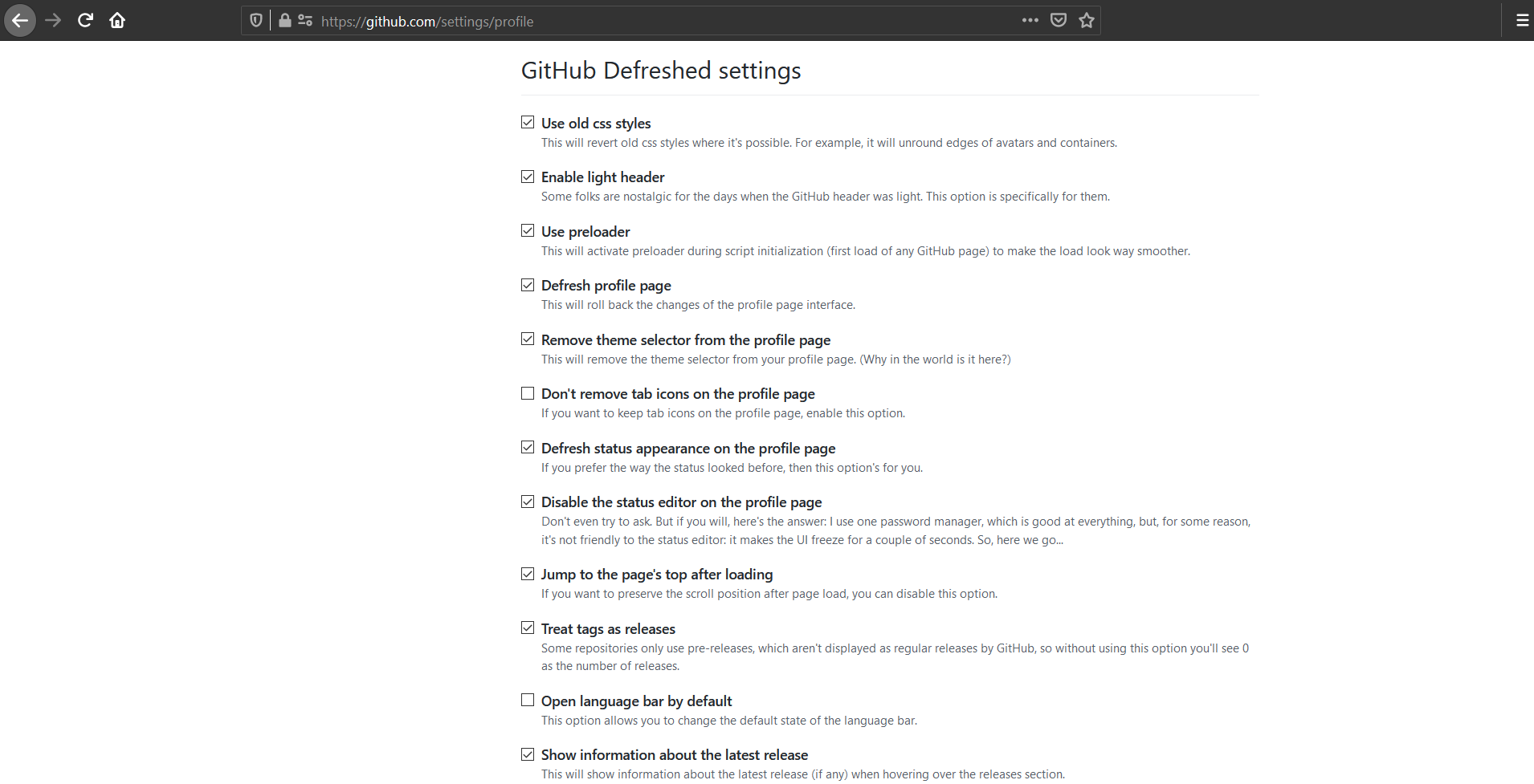
Some features of the script are optional. You can customize behavior of the GitHub-Defreshed using the web extension popup or on the profile settings page:
Build
git clone https://github.com/Kir-Antipov/GitHub-Defreshed.git
cd GitHub-Defreshed

npm install
npm run build
Why new "design" sucks
If you're not using GitHub (then what are you doing here?), new "design" from the outside may seem nice enough to you, but let's look at it from the point of view of the person who uses it:
- We don't see last commit message anymore
- We can't see the language bar anymore without scrolling page down in most repos
- "About" section, topics and so on were moved to the right sidebar - directly out of our point of attention
- On the contrary, readme was moved to the left side - again, directly out of our point of attention
- Readme container has been enlarged, but its content still fits into same dimensions, so the feeling of wasted space will not leave you while you read it
- Repository tabs are no longer felt as part of the repo
And thousands of other reasons.
Why "new design sucks" isn't subjective
Design is an extremely subjective thing, so you can say that Microsoft should not be judged strictly, but not this time, 'cause there's one simple and very objective criterion in design - information accessibility.
Previously, to understand everything about some repo, it was enough for me to take just one look at it: name, description, languages in use, releases' count, contributors, website, last commit - all this stuff was in one place exactly in my point of attention. And now...

Well, I believe, you've got the point.
Rating: 0


